Ancillary Task Research:
http://mikeedwards64.blogspot.com/2010/11/a2-research-into-existing-products-club.html
http://mikeedwards64.blogspot.com/2010/09/on-busted-album-all-band-members-are-on.html
http://mikeedwards64.blogspot.com/2011/02/magazine-advery-anaylsis.html
Music Video Research
http://mikeedwards64.blogspot.com/2010/09/hurt-johnny-cash.html
http://mikeedwards64.blogspot.com/2010/09/paulo-nutini-new-shoes.html
Planning:
http://mikeedwards64.blogspot.com/2011/05/gant-chart.html
http://mikeedwards64.blogspot.com/2011/03/music-video-ideas.html
Ancillary Tasks:
http://mikeedwards64.blogspot.com/2011/04/magazine-advert.html
http://mikeedwards64.blogspot.com/2011/02/digipack-middle.html
http://mikeedwards64.blogspot.com/2011/01/digipack-back-cover.html
http://mikeedwards64.blogspot.com/2011/01/digpack-front-cover.html
Music Video:
http://mikeedwards64.blogspot.com/2011/05/blog-post.html
Evaluation:
http://mikeedwards64.blogspot.com/2011/05/main-task-evaluation.html
Friday, 6 May 2011

Wednesday, 4 May 2011
Main Task Evaluation
After finishing both the ancillary and music videos tasks set we are happy with our final product. After initial research and planning of ideas, we created our digipack, magazine advert and music videos. We started with the animation side of our video, before adding the film later on.
Through the use of animation and film combined we've successfully challenged the 'typical' forms and conventions expected for a dance techno music video. Although the use of animation, and animation and film combined, has been used in other genres of music in videos, such as indie and alternative, it's rarely used in techno music. The fact that the film footage and animation link in the way they do made the effect even more interesting as they both contain the same character (Mario) but in two different forms. This was another intentional contrast; the use of more old fashioned media (pen and paper to draw Mario) contrast incredibly well with the use of more modern technology (the animated version of Mario), especially as they juxtaposed each other, with the animated version coming 'out' of the paper directly after as part of the narrative. This was another part of the overall plan to appeal to a wider range of people, ages and generations.
This added uniqueness to our final product, and, we felt, successfully appealed to a number of different audiences and generations through its style and execution. The idea of the music itself, modern remixed versions of classic theme tunes, encapsulated this, emphasised by the corresponding video, which linked directly to the music itself. Although this was challenging, as the music contained no lyrics in which to create our video around, we could use the overall sound, and contrast in sounds, to create something which challenged these typical conventions.
Although the ancillary tasks and the music video have a contrasting feel, we felt this worked effectively, as, like the music and the video it created somewhat of a paradox on which the video is based upon. The subtle use of images on the digipack and magazine advert was a sharp contrast to the 'loud' and bright images seen in the music video. This depth shown in the ancillary tasks would attract a wider range of consumer, who could then adapt to the contrast of the music and its wide range of appeal to different generations and age groups. This links directly to previous contrasts, such as the subtle differences between the music and the video
There could be an argument that the brand name wasn't focused or sustained enough between the ancillary tasks and music videos and this is something that, despite intentional contrast, we could have executed better. Using the brand name more may have been more effective
The audience feedback we received early on in terms of deciding the genre of our work and the type of music video we would be going for was absolutely vital. Most of our audience said they preferred something unique and different to the norm in music videos. This allowed us to brainstorm ideas and eventually come up with the more surreal and unique final design and execution. The feedback we received in terms of genre was also important - many agreed that they weren't a fan of the typical, stereotypical dance music videos, predominately set in a club environment so we felt it would stand out to do something that completely trashed this stereotype - that dance techno music can be more interesting and have more depth.
We also received feedback during our filming and animating process. The feedback was mainly positive early on when we were solely focusing on the animation, which gave us more confidence in the overall animation idea. However, some feedback we received as the piece progressed suggested we needed a better introduction. After some discussion this gave us the idea for adding the film footage early on to make the introduction more interesting and engaging.
Through the use of different software on the computer we effectively combined the use of film footage and animation to create the contrast seen in the final piece. We used the editing software Sony Vegas to implement and edit the film footage, after using the camera for filming using an over-the-shoulder shot to create a close-knit, personal feel. We used Fireworks and Windows Movie Maker to piece together the animation, before combining the two in the same software. The animation stage took a lot of time as we used the stop-and-go technique - saving images with every movement before piecing it together to create movement. We used different transitions effects - such as slow motion and fade - in Windows Movie Maker to piece the video together more fluidly.
The use of the internet for gathering images to create the animation has been useful and updating the blog has been important in keeping up to date with our workload. We also used Microsoft Excel to create a Gant chart which, again, was vital in organisation and keeping up to date with when different parts, including research and planning, had to be completed by.
In research, we used the video sharing site YouTube to gain vital style models and video techniques which we implemented into our pieces. We then embedded this into the blog to show our thought process. Google images also helped in our ancillary tasks - creating a mood board of album covers and adverts. This, again, gave an idea of our thought process as we explored different ideas, especially in terms of audience and purpose of the ancillary task and music video.
We also used cameras for audience feedback, but, unfortunately, due to technical issues, the footage was lost. This wasn't the only problem we had to overcome. The use of different software turned out to be problem as it became increasingly difficult to move different files from one software to the next, especially as we were using film footage on one and animated images on the other. We did manage to overcome this by placing every file we'd made onto one memory stick before moving it.
Although we only had one use of the camera on our film (at the start) we felt it was used effectively. The over-the-shoulder shot added a sense of intimacy for the viewer, which linked to the magical nature of the Mario character 'coming to life' and walking of the page. We edited this effectively (speeding it up and fading it in) so the meaning was easily recognisable for the viewer - this simplistic approach kept up the cartoon effect and the simple grey background and white paper made an intentionally sharp contrast when the bright coloured Mario appeared on the page. We didn't use a variety of shot distances as we didn't felt it was appropriate to the material and would have made the piece unnecessarily confusing to the viewer - the key to our music video was making sure the viewer was fully aware of the narrative and the structure.
Through the use of animation and film combined we've successfully challenged the 'typical' forms and conventions expected for a dance techno music video. Although the use of animation, and animation and film combined, has been used in other genres of music in videos, such as indie and alternative, it's rarely used in techno music. The fact that the film footage and animation link in the way they do made the effect even more interesting as they both contain the same character (Mario) but in two different forms. This was another intentional contrast; the use of more old fashioned media (pen and paper to draw Mario) contrast incredibly well with the use of more modern technology (the animated version of Mario), especially as they juxtaposed each other, with the animated version coming 'out' of the paper directly after as part of the narrative. This was another part of the overall plan to appeal to a wider range of people, ages and generations.
This added uniqueness to our final product, and, we felt, successfully appealed to a number of different audiences and generations through its style and execution. The idea of the music itself, modern remixed versions of classic theme tunes, encapsulated this, emphasised by the corresponding video, which linked directly to the music itself. Although this was challenging, as the music contained no lyrics in which to create our video around, we could use the overall sound, and contrast in sounds, to create something which challenged these typical conventions.
Although the ancillary tasks and the music video have a contrasting feel, we felt this worked effectively, as, like the music and the video it created somewhat of a paradox on which the video is based upon. The subtle use of images on the digipack and magazine advert was a sharp contrast to the 'loud' and bright images seen in the music video. This depth shown in the ancillary tasks would attract a wider range of consumer, who could then adapt to the contrast of the music and its wide range of appeal to different generations and age groups. This links directly to previous contrasts, such as the subtle differences between the music and the video
There could be an argument that the brand name wasn't focused or sustained enough between the ancillary tasks and music videos and this is something that, despite intentional contrast, we could have executed better. Using the brand name more may have been more effective
The audience feedback we received early on in terms of deciding the genre of our work and the type of music video we would be going for was absolutely vital. Most of our audience said they preferred something unique and different to the norm in music videos. This allowed us to brainstorm ideas and eventually come up with the more surreal and unique final design and execution. The feedback we received in terms of genre was also important - many agreed that they weren't a fan of the typical, stereotypical dance music videos, predominately set in a club environment so we felt it would stand out to do something that completely trashed this stereotype - that dance techno music can be more interesting and have more depth.
We also received feedback during our filming and animating process. The feedback was mainly positive early on when we were solely focusing on the animation, which gave us more confidence in the overall animation idea. However, some feedback we received as the piece progressed suggested we needed a better introduction. After some discussion this gave us the idea for adding the film footage early on to make the introduction more interesting and engaging.
Through the use of different software on the computer we effectively combined the use of film footage and animation to create the contrast seen in the final piece. We used the editing software Sony Vegas to implement and edit the film footage, after using the camera for filming using an over-the-shoulder shot to create a close-knit, personal feel. We used Fireworks and Windows Movie Maker to piece together the animation, before combining the two in the same software. The animation stage took a lot of time as we used the stop-and-go technique - saving images with every movement before piecing it together to create movement. We used different transitions effects - such as slow motion and fade - in Windows Movie Maker to piece the video together more fluidly.
The use of the internet for gathering images to create the animation has been useful and updating the blog has been important in keeping up to date with our workload. We also used Microsoft Excel to create a Gant chart which, again, was vital in organisation and keeping up to date with when different parts, including research and planning, had to be completed by.
In research, we used the video sharing site YouTube to gain vital style models and video techniques which we implemented into our pieces. We then embedded this into the blog to show our thought process. Google images also helped in our ancillary tasks - creating a mood board of album covers and adverts. This, again, gave an idea of our thought process as we explored different ideas, especially in terms of audience and purpose of the ancillary task and music video.
We also used cameras for audience feedback, but, unfortunately, due to technical issues, the footage was lost. This wasn't the only problem we had to overcome. The use of different software turned out to be problem as it became increasingly difficult to move different files from one software to the next, especially as we were using film footage on one and animated images on the other. We did manage to overcome this by placing every file we'd made onto one memory stick before moving it.
Although we only had one use of the camera on our film (at the start) we felt it was used effectively. The over-the-shoulder shot added a sense of intimacy for the viewer, which linked to the magical nature of the Mario character 'coming to life' and walking of the page. We edited this effectively (speeding it up and fading it in) so the meaning was easily recognisable for the viewer - this simplistic approach kept up the cartoon effect and the simple grey background and white paper made an intentionally sharp contrast when the bright coloured Mario appeared on the page. We didn't use a variety of shot distances as we didn't felt it was appropriate to the material and would have made the piece unnecessarily confusing to the viewer - the key to our music video was making sure the viewer was fully aware of the narrative and the structure.

Thursday, 7 April 2011
Magazine Advert

We went for a consistent design, using the same theme as we did in our digipack - this gives the advert a sophisticated feel and is instantly recognisable when compared with the digipack. This is emphasised by the use of the emphatic logo. We chose this keeping in mind other projects such as the Kids In Glasshouses advert which is consistent to their other media promotion.
The use of the sillohetted singer gives the overall pack more variety, emphasising the idea that the music isn't just one rigid genre, giving the band a more versatile look.
We choose to write 'New album coming soon' without any specific details as it gives a sense of mystery, leaving the reader interested.
Wednesday, 6 April 2011
Thursday, 10 March 2011
Music + Video ideas
After much consultation we've chosen and created the music which will then be used for our video.
Rather than go down the route of the traditional club song we choose to aim at a multi-audience and create remixes of well known theme tunes and songs. We chose this as we felt it blended classic old fashioned theme songs with a more modern style of music (techno dance), incorporating two different generations of audience.
After completing the music itself, we then discussed ideas for the video. Just like the music itself we wanted it to fit more than one audience so rather than use cameras and record we decided to make it animated. This is also linked to our group study in which people said they preferred something more outside the box than a your typical, run of the mill video.
To incorporate the multi-audience we decided to use retro images from the theme tunes being used which fit with the more modern remixed music (we got the idea of fitting the visuals to the music like a story from Paulo Nutini's New Shoes).
Here's some examples of animated videos that we were inspired by:
Although these videos don't exactly fit our genre we felt the animation added an extra dimension to the video, and would work especially well with the song we had made.
The stop and go method we are using in Firefox is a technique widely used in animation - including Wallace & Gromit (although this does use plastercine rather than computer images)
Rather than go down the route of the traditional club song we choose to aim at a multi-audience and create remixes of well known theme tunes and songs. We chose this as we felt it blended classic old fashioned theme songs with a more modern style of music (techno dance), incorporating two different generations of audience.
After completing the music itself, we then discussed ideas for the video. Just like the music itself we wanted it to fit more than one audience so rather than use cameras and record we decided to make it animated. This is also linked to our group study in which people said they preferred something more outside the box than a your typical, run of the mill video.
To incorporate the multi-audience we decided to use retro images from the theme tunes being used which fit with the more modern remixed music (we got the idea of fitting the visuals to the music like a story from Paulo Nutini's New Shoes).
Here's some examples of animated videos that we were inspired by:
Although these videos don't exactly fit our genre we felt the animation added an extra dimension to the video, and would work especially well with the song we had made.
The stop and go method we are using in Firefox is a technique widely used in animation - including Wallace & Gromit (although this does use plastercine rather than computer images)
Thursday, 3 February 2011
Digipack - Middle

For the inside of the digipack, we chose to use the same theme as the front cover - this gave the package as a whole a more consistent look as we didn't want to overcomplicate things and make it too over-the-top for the audience - an audience of young club goers who wouldn't want something too complex.
Tuesday, 1 February 2011
Magazine Advert Anaylsis


The consistent, simple beige colour theme used on both the advert and the album cover add an aura of sophistication. It's practically the same except for the added information advertising the product.
The contrast in the use of flowers to write the word 'dirt' adds a sense of irony and a deeper meaning to the music behind it's simple exterior.
It also has a multi-audience - it's simple enough to appeal to a younger audience, yet an older audience will appreciate it's subtlety and contrasts within the logo and design.
When we do our magazine advert we'll be sure to incorporate similar colour schemes and designs to our CD cover keep up a consistent and sophisticated feel to the music - this is also a key marketing scheme as it means the audience can familarize themselves with similar looking designs.
We'll also look to make advert attract different audiences, something we've already done with our digipack.
Tuesday, 4 January 2011
Digipack - Back Cover

For the back cover, we made sure it had a corralation to the front cover so kept the black background and used a similar shaped design but we choose more of a flame shape to add a more edgy effect, which shows, perhaps, a deeper side to the music than the typical (for a dance album) front cover which engages the audience.
This shows how we are catering for two audiences. The front cover is aimed to attract attention a younger audience, and the back cover engages the audience fully, especially a more mature one.
We felt we the contract between the front and back was perfect.
Digipack - Front Cover


After looking at existing products almost all the covers had a variety of styles but with one common similarity - the use of bright colours, which we employed with a darker background to give a strobe light/club feel. To emphasises this to the audience we added in faded dancing silhouettes, with the name of our album - 'Skylight' in a font that suited the rest of the cover in design and colour. We felt this suited our young audience of club goers, as the design is relatively straightforward to understand.
We used fireworks to design the cover using the line tool followed by the freeform to get the shape seen above. The silhouttes were also outlined using the freeform tool and coloured in black using the fill tool. Using the Fade feature we made the silhouettes less lifelike - this added a sense of the surreal, something young people who go to clubs are looking for.
Tuesday, 9 November 2010
A2 Research Into Existing Products - Club Music
Our group has decided to make our own music using the Musix Maker programme - this is becasue we wanted to make something totally original which would fit a music video with our own creative ideas - it would mean that everything would be totally our own work and it would help us into fitting our own ideas into a song as well as a video and artwork.
We chose club music as this is something that interests all members of the group and based on our focus group we felt the younger members of the group liked dance and beats in their music videos - something that's prominent in club music and we felt appealing to a more contemporary audience is important.
I did some research into exisiting album covers for club music, and came up with this group of covers

All these covers share the same ingredients - bright colours and bold, 3D effect text, along with club style lighting. This stands out to the viewer and shows straight away the type of music it is - these effects are typical of all club album covers and something we will try and employ in our promotional package, along with our own twists based on how the music sounds.
The artist of the music is very rarely on the front cover which is good for our group as were making it ourselves. All the covers have a summery feel with the choice of colour and (lack of) images - this mood is reflected in all the covers I've looked at and through colour, images and text something that our cover will have to get across. The music gives off a party feel as it's used in clubs so this will have to be reflected in our cover.
I also had a look at music videos for club music. The majority of the videos were set in clubs but this will be tough for us to do due to the impracticality of filming in a club. Looking back at our focus group, some of the older members of the group liked to see something a bit more creative than a typical video you'd see all the time - this is something we'll definitely be considering once our music is actaully complete so we know how far to go outside the box with the video and what effects our needed to make sure the video and the music go together well.
We chose club music as this is something that interests all members of the group and based on our focus group we felt the younger members of the group liked dance and beats in their music videos - something that's prominent in club music and we felt appealing to a more contemporary audience is important.
I did some research into exisiting album covers for club music, and came up with this group of covers

All these covers share the same ingredients - bright colours and bold, 3D effect text, along with club style lighting. This stands out to the viewer and shows straight away the type of music it is - these effects are typical of all club album covers and something we will try and employ in our promotional package, along with our own twists based on how the music sounds.
The artist of the music is very rarely on the front cover which is good for our group as were making it ourselves. All the covers have a summery feel with the choice of colour and (lack of) images - this mood is reflected in all the covers I've looked at and through colour, images and text something that our cover will have to get across. The music gives off a party feel as it's used in clubs so this will have to be reflected in our cover.
I also had a look at music videos for club music. The majority of the videos were set in clubs but this will be tough for us to do due to the impracticality of filming in a club. Looking back at our focus group, some of the older members of the group liked to see something a bit more creative than a typical video you'd see all the time - this is something we'll definitely be considering once our music is actaully complete so we know how far to go outside the box with the video and what effects our needed to make sure the video and the music go together well.
Wednesday, 22 September 2010
Hurt - Johnny Cash
In 2003 Johnny Cash covered the Nine Inch Nails song “Hurt” after hooking up with legendary producer Rick Rubin. The original was industrial rock but Cash gave it a country and western twist, giving a more emotional feel. Cash gives hindsight into his life and the mistakes he made in his life through the music video - his declining health was also highlighted. The video was seen as iconic in Cash’s career as he died only 5 months after the video was made.
To really understand the full emotional pain in the video, it’s important to look at events in Cash’s personal life. His older brother, Jack, was killed after being pulled into a saw mill, in 1944, and Cash was emotionally scarred by the incident, being only 12 at the time. His divorce from his first wife, Vivian Liberto, is the incident that most relates to the lyrics in the song as it began the downward spiral into an addiction of drugs, alcohol and affairs with other women. The video portrays this by showing clips of Cash in his youth followed by his present state. His wife also features in the video, although that wasn’t the original plan. We also see images of the Johnny Cash museum – once in its heyday and later when it’s rundown and ruined. This represents how Cash’s health and career have fallen from the top to the bottom.
The lyrics in the Cash’s version are identical except he changes the lyric “I wear this crown of shit” to “I wear this crown of thorns”, to compare himself to Jesus’ crucifixion in terms of his illness. The religious references don’t stop there – an image of a crucifix is shown many times and we see fruit and wine on Cash’s table – a reference to the last supper. The constant references to religion and Jesus in particular are there to highlight how Cash’s life has gone from one where he is idolised to near-death.
The editing of the video is important as the slow, long takes create a mellow atmosphere that, combined with the old pictures of Cash’s career, really emphasise the sadness and pain of Cash. Also the slow pace lets you follow the story and understand Cash’s pain even more.
The video was successful as it played on the heartstrings of the audience as Cash’s ill-health gained huge sympathy as he was such a popular figure in his prime. The contrast between Cash’s hugely successful career and younger life to his declining health in the video made the video iconic, especially with his death coming only 5 months later.
To really understand the full emotional pain in the video, it’s important to look at events in Cash’s personal life. His older brother, Jack, was killed after being pulled into a saw mill, in 1944, and Cash was emotionally scarred by the incident, being only 12 at the time. His divorce from his first wife, Vivian Liberto, is the incident that most relates to the lyrics in the song as it began the downward spiral into an addiction of drugs, alcohol and affairs with other women. The video portrays this by showing clips of Cash in his youth followed by his present state. His wife also features in the video, although that wasn’t the original plan. We also see images of the Johnny Cash museum – once in its heyday and later when it’s rundown and ruined. This represents how Cash’s health and career have fallen from the top to the bottom.
The lyrics in the Cash’s version are identical except he changes the lyric “I wear this crown of shit” to “I wear this crown of thorns”, to compare himself to Jesus’ crucifixion in terms of his illness. The religious references don’t stop there – an image of a crucifix is shown many times and we see fruit and wine on Cash’s table – a reference to the last supper. The constant references to religion and Jesus in particular are there to highlight how Cash’s life has gone from one where he is idolised to near-death.
The editing of the video is important as the slow, long takes create a mellow atmosphere that, combined with the old pictures of Cash’s career, really emphasise the sadness and pain of Cash. Also the slow pace lets you follow the story and understand Cash’s pain even more.
The video was successful as it played on the heartstrings of the audience as Cash’s ill-health gained huge sympathy as he was such a popular figure in his prime. The contrast between Cash’s hugely successful career and younger life to his declining health in the video made the video iconic, especially with his death coming only 5 months later.
Busted & Fightstar Album Covers


On the Busted album all the band members are on the cover to promote the star appeal of the album. The logo is prominent on the cover so it’s easily recognizable for its young audience. There are no band members on the cover of the Fightstar album as the band is looking for something more meaningful than just promotion and star appeal. The image used – a women and child on the steps of a house surrounded by a flood create an incredibly thought-provoking, surreal feel to the album. The band name isn’t the most prominent thing on the page and isn’t meant to stand out like the Busted one.
The Busted cover is very simple in terms of colour. It uses primary colours and there’s only 3 colours used. The Fightstar cover, on the other hand, uses darker more somber colours and there is far more depth, light, shade and perspective compared to the Busted cover which has no light, shade or depth.
The cover creates a simple vibrant look which would appeal to a young demographic as there is nothing more to the cover than what you see. The Fightstar cover, in huge contrast, creates a much more artistic and meaningful cover which could have many different meanings behind it. It is far less poppy as it isn’t aimed at a mainstream audience and more at people who specifically understand and listen to the genre of music Fightstar make.


The Busted cover is very similar to the previous one. It has all the band members on the front cover with the logo prominent. Again this is to appeal to a young demographic and to a mainstream audience. There is very little more to the cover than the images you can see. Again, this is in complete contrast to Fightstar image, which is complex and thought provoking – it’s likely to have some relation to the music itself whereas the images for the Busted cover are purely for promotion. The logo on this cover is different to the previous Fightstar logo which shows they’re not relying on the name of the band to sell the album and would rather let the music do the talking.
The colours on the Busted cover are, as with the previous cover, primary and as simple as possible to not overcomplicate the page. This appeals to the mainstream target audience. This is a huge contrast to the somber, dark coloured Fightstar cover which has depth, shade and perspective, similar to the previous cover.
The simple cover of the Busted album, exactly like the previous one, gives the effect of mainstream simple music that would appeal to a young, pop demographic, as there is nothing more than meets the eye than the bright front cover. The Fightstar cover, in contrast, has much more to it than meets the eye and the music and the reasons behind the music, would, more than likely, explain the cover choice. It’s appeal is more at a core fan base who are into their style of music rather than a huge demographic, like the Busted cover.
Paulo Nutini – New Shoes
The video starts with a animated images of a street before we see into the inside of one of the houses which is real with Nutini lay in bed. The caption says “Paulo Nutini… as himself” – this comedy film-like opening gives the impression that the song will be pretty lighthearted and fun, which it is. The video relates exactly to the lyrics, which tell the story of a day with his new shoes – the events happening in the video relate directly to the lyrics at the same time. This makes the story flow better.
As Nutini’s music is mixture of genres the video doesn’t follow any typical conventions of a certain genre which gives more creative freedom in terms the editing and camera shots as there is no “rules” to follow – this also gives Nutini much more artistic freedom.
The camera shots used throughout the video are all a front view of Nutini as he goes about his day. We see the story unfold through this view and it lets the viewer familiarizes themselves with Nutini as well as making the transitions flow better. It creates an interesting way to tell the story as we only see one perspective to it. Also, it gives a star quality to Nutini and is instant marketing for the artist as the audience will remember him.
Fast takes are used in the editing to speed the story up and engage the viewer in the song and the video. This makes the video more interesting and fun to watch and suits the light hearted tone of both the song and video. This links in with the animated scene at the beginning of the video.
Thursday, 22 April 2010
The Phantom (FILM)
Research Into Existing Products
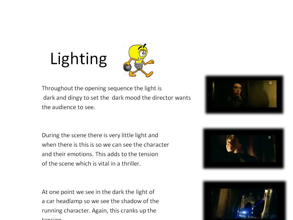
Before we even started our preliminary task, we had to research into existing films to get ideas and techniques (including camera shots, lighting and sound) used the film that we could then use in our own film. I chose to look at the action thriller XXX. (click on image to see larger)



Tuesday, 30 March 2010
Main Task Evaluation
I felt that the filming and editing of our media film was hugely successful. After our original planning stage, we went straight into filming, closely following our storyboard and script.
We then started drawing up a script. To make this as realisitic as possible we put ourselves into the roles of the characters and using out storyboard, instinctively improvised the speech. This would then make our script sound like a real conversation rather than unrealisitic and monotonous.
When filimg and editing, however, we had to take into consideration the target audience for our piece. We were aiming our film at any gender from age 15-30. This was, becuase of the violent nature of our initial idea, we didn't think it would be suitable for any below the age of 15. Therefore, when doing our script, we were able to add in swearing and more adult lanaguage to make it more realistic and suit the audience it was aimed at. We also felt a more mature audience would appreciate more stylistic features, such as the point of view shot from the phantom (including the heavy breathing sound) and a more wide ranging use of the camera, which we used most notably when the phantom was looking at the explorers from the bushes. Also, premonitions are something that will be grasped better and taken more seriously by an older audience. This gave us room for freedom and creativity.
After the planning stage, we got straight into our filming. We completed our filming process over a few days and then took a further few weeks to edit our film. We felt that we completed our film to match the brief as well as possible by keeping it under 2 minutes and gave the common expectations of the opening of a thriller as we made the beginning almost like an anecdote to the rest of the film, as it shows what the Phantom could do and leaves the audience unsure of what will happen but excited to find out.
We followed closely the Final Destination 3 opening in terms of the premonition idea. However, in our film, we used more effects to make it seem clearer that it was a premonition so not to confuse the viewer. For example, at the end of the premonition, we zoomed into one of the characters eyes then back out again to the beginning of the film again. This created the effect that everything that has happened was in his head. We also used flashes as the camera went in and out of the characters eyes, which created a confused effect. Using the basis of these ideas we’ve our unique twists on it helped us make this idea much more effective and helped us make the film like a modern day thriller with our own ideas incorporated within.
We also followed the brief when it came to technical abilities:
-Holding a Shot Steady - We used this plenty of times throughout our film. A good example was at the beginning of the film where we had an establishing shot to set the film. This had to be steady so the viewer could instantly see the surroundings. Looking back on this shot, however, we felt that we should have shot this from higher up to give an even greater perpective, although this was impracticle at the time. This was also used at the end of the film when one of the characters walks away - this is pivotle to the opening and meant we had to keep the shot still.
-Using a Variety of Shot Distances - Throughout the film we shot from different distances. We used a close-up shot just before the Phantom attacks Chris, a mid shot when Will and Chris were talking at the beginning and a long shot when the Phantom watches them walk away from at the top of the building. The point of view shots from the phantom all have a variety of distances - from watching Chris and Will at the begining from a long distance to watching them from the bushes at a short distance to chasing Will with a medium shot.
-Shooting Material Appropriate To The Task Set - Our material suited the idea of an opening of a thriller in the fact it was under 2 minutes long and would have left the viewer wondering what will happen next. The use of a premonition is typical in contemporary films, especially in openings.
-Selecting Mise-en-Scene - We chose to shoot our film in the back lanes behind our school. This gave a spooky, mysterious effect for our film and suited the idea that the Phantom was haunting an abandoned school. Our clothing for Will and Chris wasn't too formal as they were only young explorers and were chasing a beast but weren't too casual as they were on a serious mission.
-Editing so that Meaning is Apparent to the Viewer - During the editing process we added in a range of colours and a heartbeat sound whenever the camera was from the Phantom's point of view so the viewer would immediately know this was no ordinary character and would identify when the shots were just "narracting" to when we looking from the phantom's point of view.. We also used a two flashes of black when the premonition had finished so this was fully apparent to the viewer.
-Using a Variety of Appropriate Shot Transitions - As Will is killed, we used quick flashes to change from the premonition back to the beginning of the film again. This created an interesting effect and made it apparent to the viewer that the previous action was a premonition. We also used quick transitions when the phantom is seen running down the stairs and out of the door - this, combined with the shaky camera movements, created another sense of tension.
-Using Sound With Images And Editing Appropriately - In the editing process, we added in different sound effects, including a heartbeat when the phantom was on a screen, to create mystery and throughout a quiet bit of tense music up until the phantom attacks which created a huge amount of suspense in the piece
-Using titles appropriately - The final bit of editing involved adding in a 20th Century Fox opening and, after creating the logo for out film, we added this in with a spooky transition to create a thriller-type effect. After consideration we didn't feel this titles were good enough and decided to change them. After using artofthetitle.com as a guide we used an idea that's prominent in many contempary films: short clips relating to what the film is about are used. We used clips showing piles of books on a table, a noteboard with clippings on and a whiteboard with scribblings all over it - this relates to the explorers in the opening and Chris' first line: "We've been researching this for 6 whole years". We followed this up with the name of the film.
We received good audience feedback from our piece and everyone enjoyed the editing process as we took our time perfecting it and the variety of camera shots. We also received good feedback for the parts where the phantom was on screen as this point of view shot created a very unique look and gave an exciting and mysterious feel to the piece. There were some things that the audience felt we could have improved, especially our opening shots, which looked much more amateur than the rest of our film. If we were to do this again, we would think more carefully about our opening shot and try to make this more creative, maybe making the shot higher to get a better perspective of the surroundings.
We used modern technologies when planning and editing our film. During the planning process, we used the internet and DVD and video to research into other thriller films, including the ones I mentioned above which influenced out final piece. We also used the 2D Design Programme to create a more professional looking storyboard and Microsoft Word to create a script. In the planning stages I also used Microsoft Powerpint to create a slideshow showing research into the film XXX - this was then put into Paint using the Print Screen button so it could easily be uploaded to Blogger. Every bit of work we have done in lessons has been updated on Blogger. Although we had some problems uploading things to the site, we managed to work our way around it.
During editing, we used Adobe Premier to edit our film. At first, we struggled to upload our film to it, but after changing cameras, we solved this problem. We could then use plenty of different techniques on the programme, to make our film look as professional as possible. We also got sounds and music from files that had already been added to the music programme iTunes.
I felt that we made huge progress from our preliminary task to our final main task, especially in using original ideas and concepts. We spent much more time planning (see the Time Sheet) our piece which gave us a good idea of what we wanted in terms of editing, storyboarding and camera shots. We could also be much more creative when filming our piece, making the final product more polished and professional.
We then started drawing up a script. To make this as realisitic as possible we put ourselves into the roles of the characters and using out storyboard, instinctively improvised the speech. This would then make our script sound like a real conversation rather than unrealisitic and monotonous.
When filimg and editing, however, we had to take into consideration the target audience for our piece. We were aiming our film at any gender from age 15-30. This was, becuase of the violent nature of our initial idea, we didn't think it would be suitable for any below the age of 15. Therefore, when doing our script, we were able to add in swearing and more adult lanaguage to make it more realistic and suit the audience it was aimed at. We also felt a more mature audience would appreciate more stylistic features, such as the point of view shot from the phantom (including the heavy breathing sound) and a more wide ranging use of the camera, which we used most notably when the phantom was looking at the explorers from the bushes. Also, premonitions are something that will be grasped better and taken more seriously by an older audience. This gave us room for freedom and creativity.
After the planning stage, we got straight into our filming. We completed our filming process over a few days and then took a further few weeks to edit our film. We felt that we completed our film to match the brief as well as possible by keeping it under 2 minutes and gave the common expectations of the opening of a thriller as we made the beginning almost like an anecdote to the rest of the film, as it shows what the Phantom could do and leaves the audience unsure of what will happen but excited to find out.
We followed closely the Final Destination 3 opening in terms of the premonition idea. However, in our film, we used more effects to make it seem clearer that it was a premonition so not to confuse the viewer. For example, at the end of the premonition, we zoomed into one of the characters eyes then back out again to the beginning of the film again. This created the effect that everything that has happened was in his head. We also used flashes as the camera went in and out of the characters eyes, which created a confused effect. Using the basis of these ideas we’ve our unique twists on it helped us make this idea much more effective and helped us make the film like a modern day thriller with our own ideas incorporated within.
We also followed the brief when it came to technical abilities:
-Holding a Shot Steady - We used this plenty of times throughout our film. A good example was at the beginning of the film where we had an establishing shot to set the film. This had to be steady so the viewer could instantly see the surroundings. Looking back on this shot, however, we felt that we should have shot this from higher up to give an even greater perpective, although this was impracticle at the time. This was also used at the end of the film when one of the characters walks away - this is pivotle to the opening and meant we had to keep the shot still.
-Using a Variety of Shot Distances - Throughout the film we shot from different distances. We used a close-up shot just before the Phantom attacks Chris, a mid shot when Will and Chris were talking at the beginning and a long shot when the Phantom watches them walk away from at the top of the building. The point of view shots from the phantom all have a variety of distances - from watching Chris and Will at the begining from a long distance to watching them from the bushes at a short distance to chasing Will with a medium shot.
-Shooting Material Appropriate To The Task Set - Our material suited the idea of an opening of a thriller in the fact it was under 2 minutes long and would have left the viewer wondering what will happen next. The use of a premonition is typical in contemporary films, especially in openings.
-Selecting Mise-en-Scene - We chose to shoot our film in the back lanes behind our school. This gave a spooky, mysterious effect for our film and suited the idea that the Phantom was haunting an abandoned school. Our clothing for Will and Chris wasn't too formal as they were only young explorers and were chasing a beast but weren't too casual as they were on a serious mission.
-Editing so that Meaning is Apparent to the Viewer - During the editing process we added in a range of colours and a heartbeat sound whenever the camera was from the Phantom's point of view so the viewer would immediately know this was no ordinary character and would identify when the shots were just "narracting" to when we looking from the phantom's point of view.. We also used a two flashes of black when the premonition had finished so this was fully apparent to the viewer.
-Using a Variety of Appropriate Shot Transitions - As Will is killed, we used quick flashes to change from the premonition back to the beginning of the film again. This created an interesting effect and made it apparent to the viewer that the previous action was a premonition. We also used quick transitions when the phantom is seen running down the stairs and out of the door - this, combined with the shaky camera movements, created another sense of tension.
-Using Sound With Images And Editing Appropriately - In the editing process, we added in different sound effects, including a heartbeat when the phantom was on a screen, to create mystery and throughout a quiet bit of tense music up until the phantom attacks which created a huge amount of suspense in the piece
-Using titles appropriately - The final bit of editing involved adding in a 20th Century Fox opening and, after creating the logo for out film, we added this in with a spooky transition to create a thriller-type effect. After consideration we didn't feel this titles were good enough and decided to change them. After using artofthetitle.com as a guide we used an idea that's prominent in many contempary films: short clips relating to what the film is about are used. We used clips showing piles of books on a table, a noteboard with clippings on and a whiteboard with scribblings all over it - this relates to the explorers in the opening and Chris' first line: "We've been researching this for 6 whole years". We followed this up with the name of the film.
We received good audience feedback from our piece and everyone enjoyed the editing process as we took our time perfecting it and the variety of camera shots. We also received good feedback for the parts where the phantom was on screen as this point of view shot created a very unique look and gave an exciting and mysterious feel to the piece. There were some things that the audience felt we could have improved, especially our opening shots, which looked much more amateur than the rest of our film. If we were to do this again, we would think more carefully about our opening shot and try to make this more creative, maybe making the shot higher to get a better perspective of the surroundings.
We used modern technologies when planning and editing our film. During the planning process, we used the internet and DVD and video to research into other thriller films, including the ones I mentioned above which influenced out final piece. We also used the 2D Design Programme to create a more professional looking storyboard and Microsoft Word to create a script. In the planning stages I also used Microsoft Powerpint to create a slideshow showing research into the film XXX - this was then put into Paint using the Print Screen button so it could easily be uploaded to Blogger. Every bit of work we have done in lessons has been updated on Blogger. Although we had some problems uploading things to the site, we managed to work our way around it.
During editing, we used Adobe Premier to edit our film. At first, we struggled to upload our film to it, but after changing cameras, we solved this problem. We could then use plenty of different techniques on the programme, to make our film look as professional as possible. We also got sounds and music from files that had already been added to the music programme iTunes.
I felt that we made huge progress from our preliminary task to our final main task, especially in using original ideas and concepts. We spent much more time planning (see the Time Sheet) our piece which gave us a good idea of what we wanted in terms of editing, storyboarding and camera shots. We could also be much more creative when filming our piece, making the final product more polished and professional.
Thursday, 11 February 2010
Storyboard

This is the storyboard which out group will use as a basis to work upon when filming our 2 minute opening. Although we'll work ideas around this, this is the general plot.
Thursday, 28 January 2010
Script
This is the final script we have decided upon for our filming.
Character List:
Will (played by Mike)
Chris (played by Joe)
Phantom (played by Reece)
Will: Chris, I really don’t know, this doesn’t feel right…
Chris: Will! We’ve been researching this for 6 whole years! And you want to back out now?
Will: Yeah… sorry, just last-minute nerves…
(Will glances up at abandoned school. Switch to phantom point of view)
Phantom: (heavy breathing)
(Quick takes of phantom down stairs, out of door, going to the path. Phantom spies in bushes on Chris and Will talking)
Chris: Christ, Will, you look like you’ve seen a ghost... (Laughs)
Will: (shouts) SHUT UP! I can’t do this!
(Will walks off. Twig snaps. Will turns round)
Chris: …the fuck?!
(Phantom attacks Chris and kills him. Will starts running)
(Trips over. Phantom attacks)
Will: ARRRGHHHH!
(Camera zooms out of eye. Back to beginning)
Chris: Will! We’ve been researching this for 6 whole years! And you want to back out now?
Will: Chris! Listen to me, we can’t do this. I’ve seen what’s gunna happen…
(Interrupted by Chris)
Chris: What?! Well, if you’re such a psychic, fuck off then. I’m doing this, whether you’re coming or not.
Will: Please, Chris! I’m begging you. Don’t go!
Chris: Did you just hear what I said? I’m going whether you’re coming or not.
Will: (angry) don’t say I didn’t warn you Chris!! (Storms off)
(Camera behind Will walking away. Looks round and hears scream)
(Zooms into Will’s eye. Blackout)
Character List:
Will (played by Mike)
Chris (played by Joe)
Phantom (played by Reece)
Will: Chris, I really don’t know, this doesn’t feel right…
Chris: Will! We’ve been researching this for 6 whole years! And you want to back out now?
Will: Yeah… sorry, just last-minute nerves…
(Will glances up at abandoned school. Switch to phantom point of view)
Phantom: (heavy breathing)
(Quick takes of phantom down stairs, out of door, going to the path. Phantom spies in bushes on Chris and Will talking)
Chris: Christ, Will, you look like you’ve seen a ghost... (Laughs)
Will: (shouts) SHUT UP! I can’t do this!
(Will walks off. Twig snaps. Will turns round)
Chris: …the fuck?!
(Phantom attacks Chris and kills him. Will starts running)
(Trips over. Phantom attacks)
Will: ARRRGHHHH!
(Camera zooms out of eye. Back to beginning)
Chris: Will! We’ve been researching this for 6 whole years! And you want to back out now?
Will: Chris! Listen to me, we can’t do this. I’ve seen what’s gunna happen…
(Interrupted by Chris)
Chris: What?! Well, if you’re such a psychic, fuck off then. I’m doing this, whether you’re coming or not.
Will: Please, Chris! I’m begging you. Don’t go!
Chris: Did you just hear what I said? I’m going whether you’re coming or not.
Will: (angry) don’t say I didn’t warn you Chris!! (Storms off)
(Camera behind Will walking away. Looks round and hears scream)
(Zooms into Will’s eye. Blackout)
Subscribe to:
Posts (Atom)